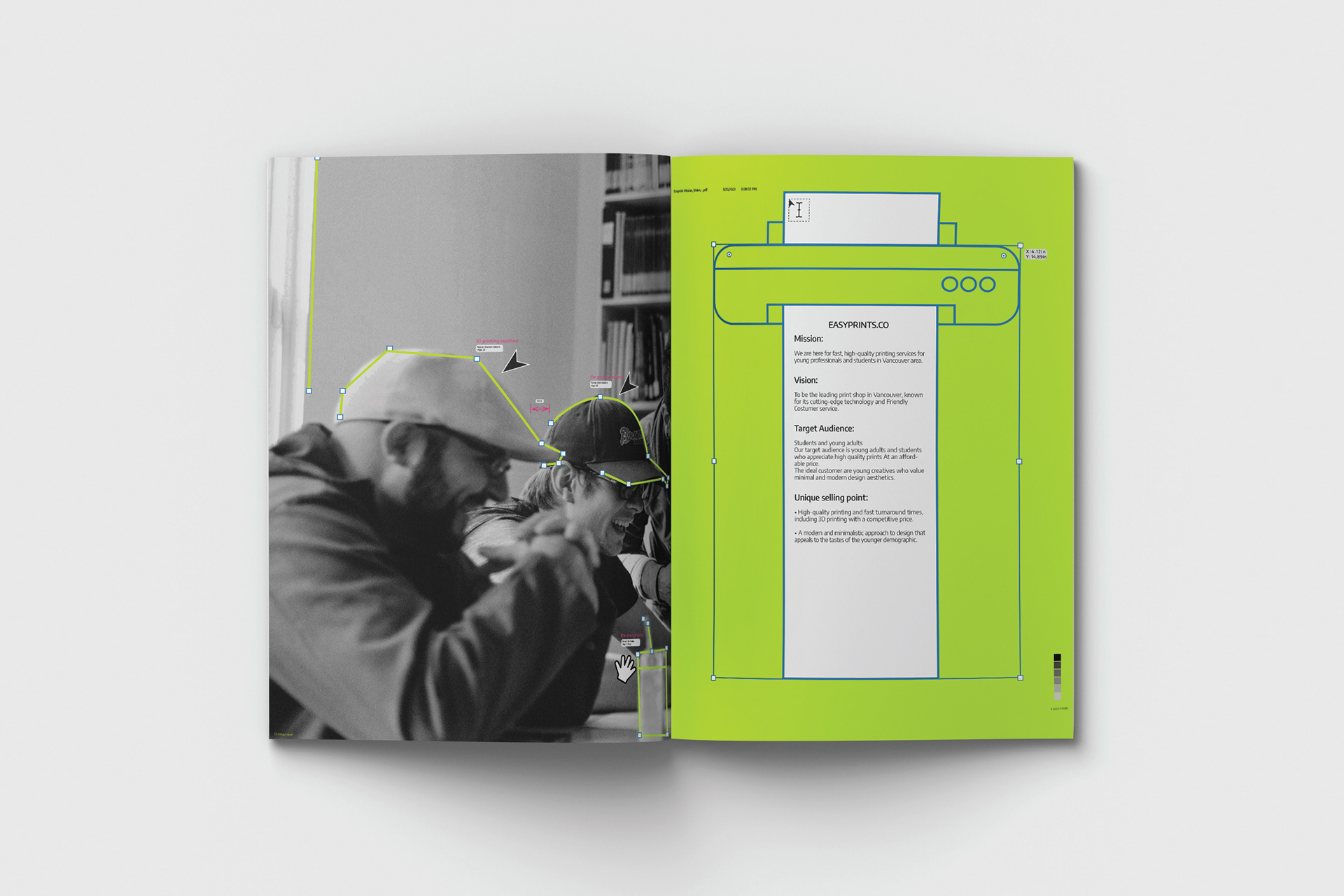
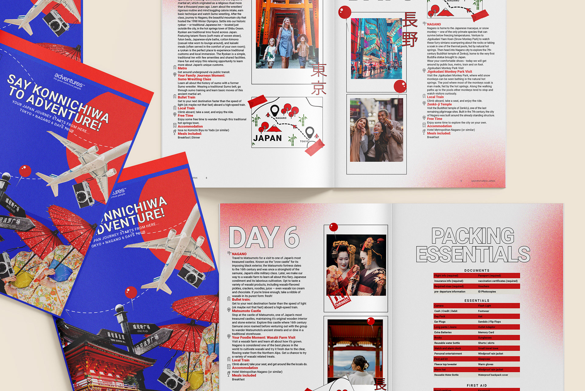
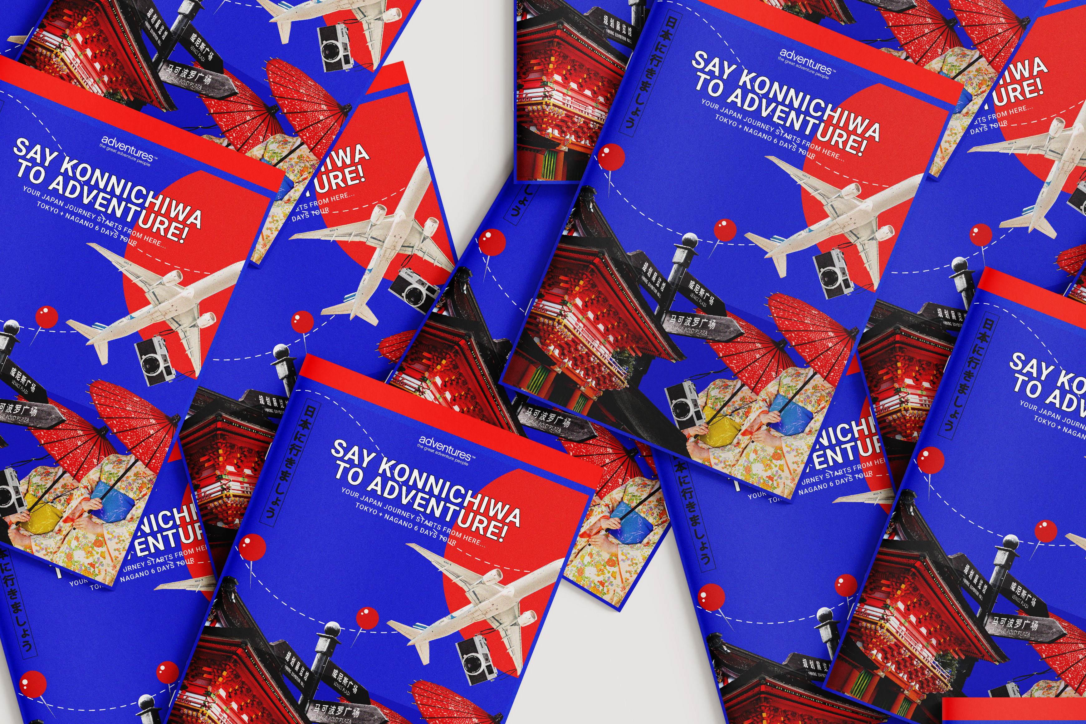
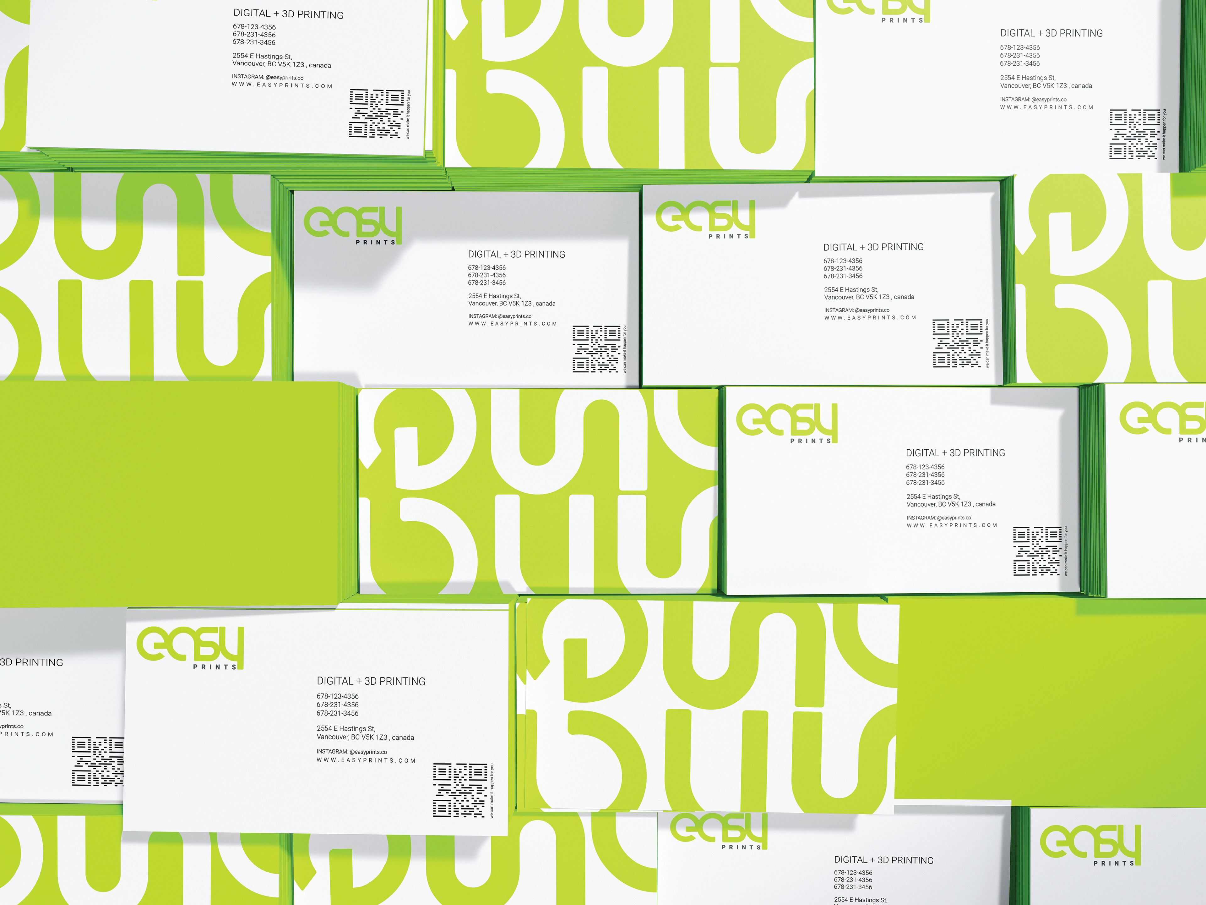
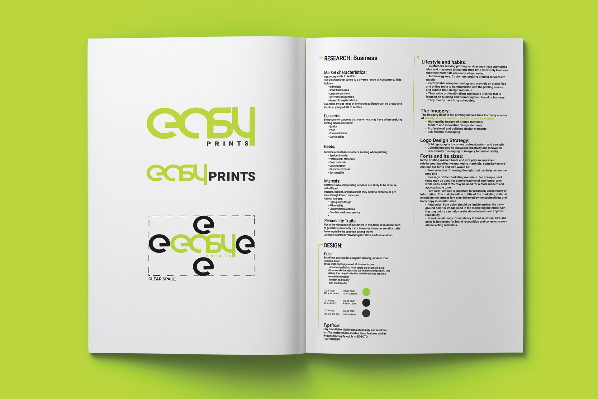
The EASY PRINTS branding project focuses on developing a professional and modern identity for a print shop located in Vancouver’s East Village. It aims to build a strong, recognizable brand that serves a wide range of customers. from individuals and small businesses to larger corporations. The goal is to create an identity that is both professional and creative, reliable and innovative, ensuring a distinct and impactful presence in the print industry.


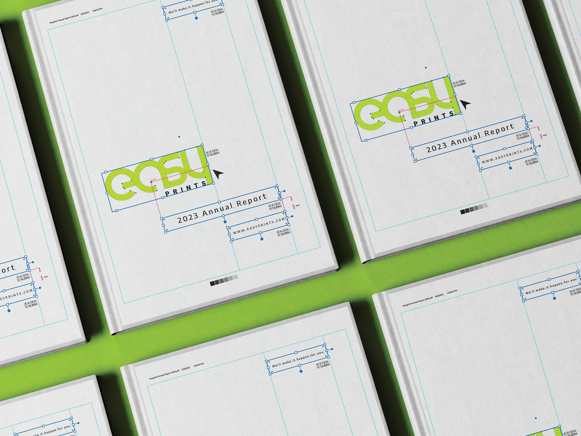
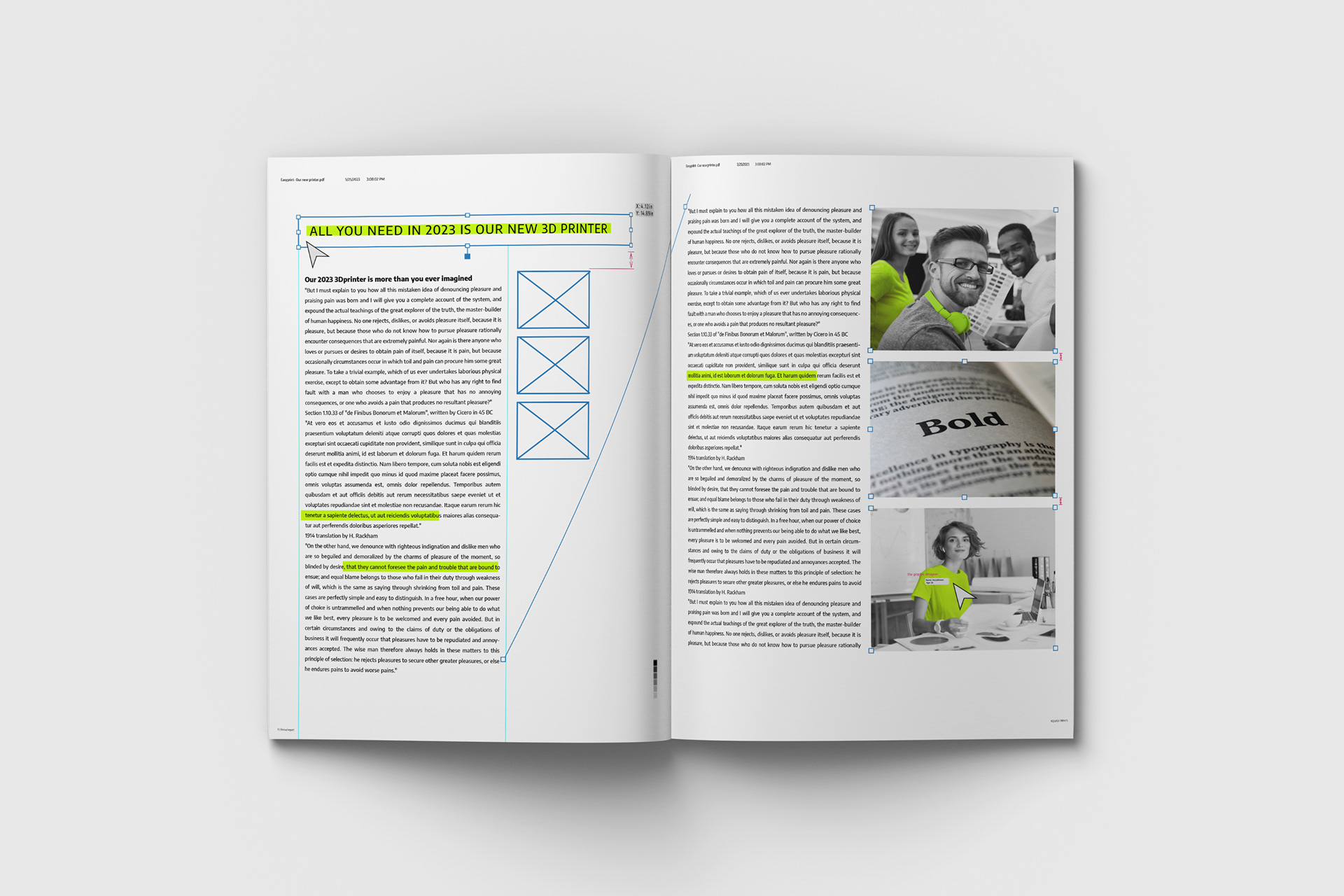
The annual report project for the EASY PRINTS has been designed to incorporate elements and tools that are commonly used by designers in Adobe Illustrator. By utilizing these design elements, the project aims to create a visually appealing and creative design that is closely related to the print business.
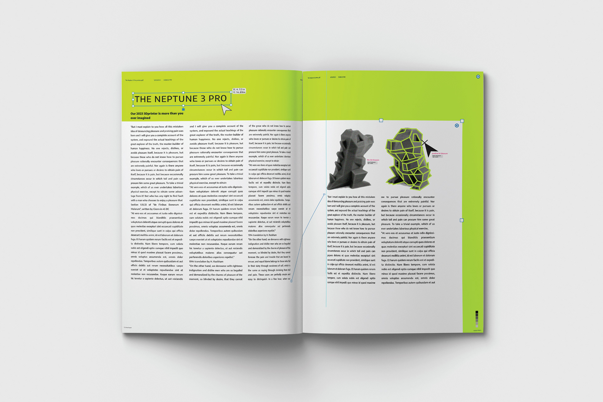
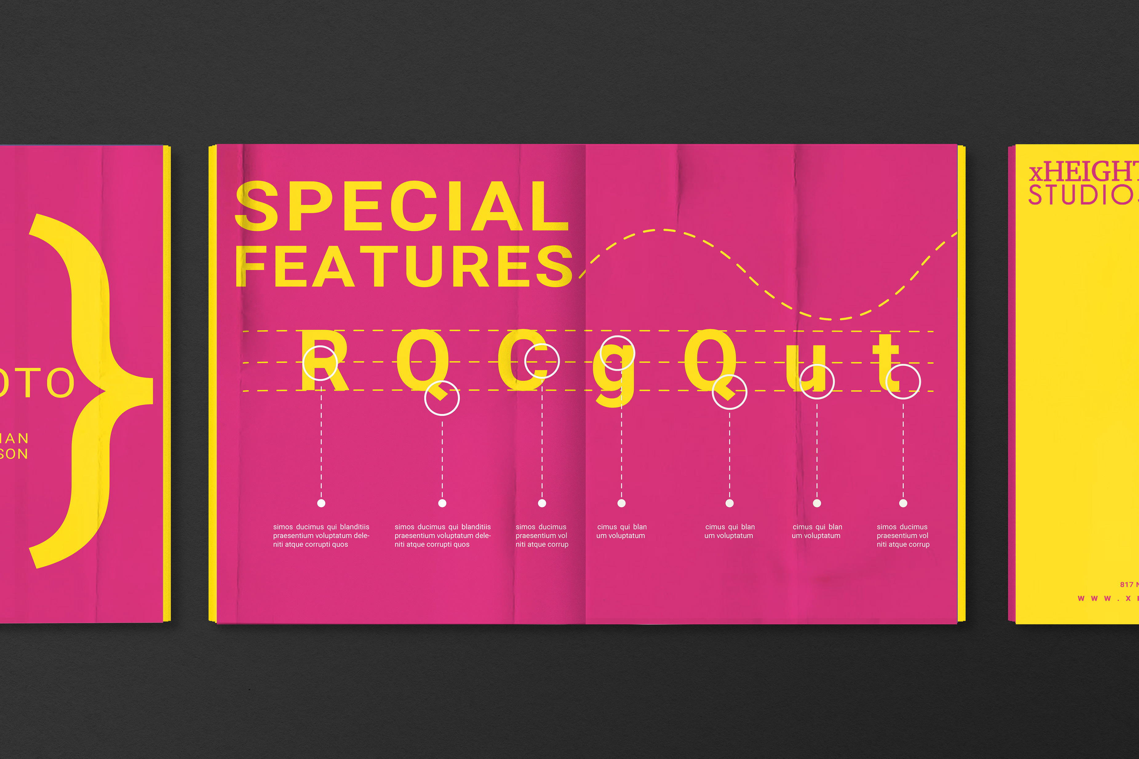
Design Elements:
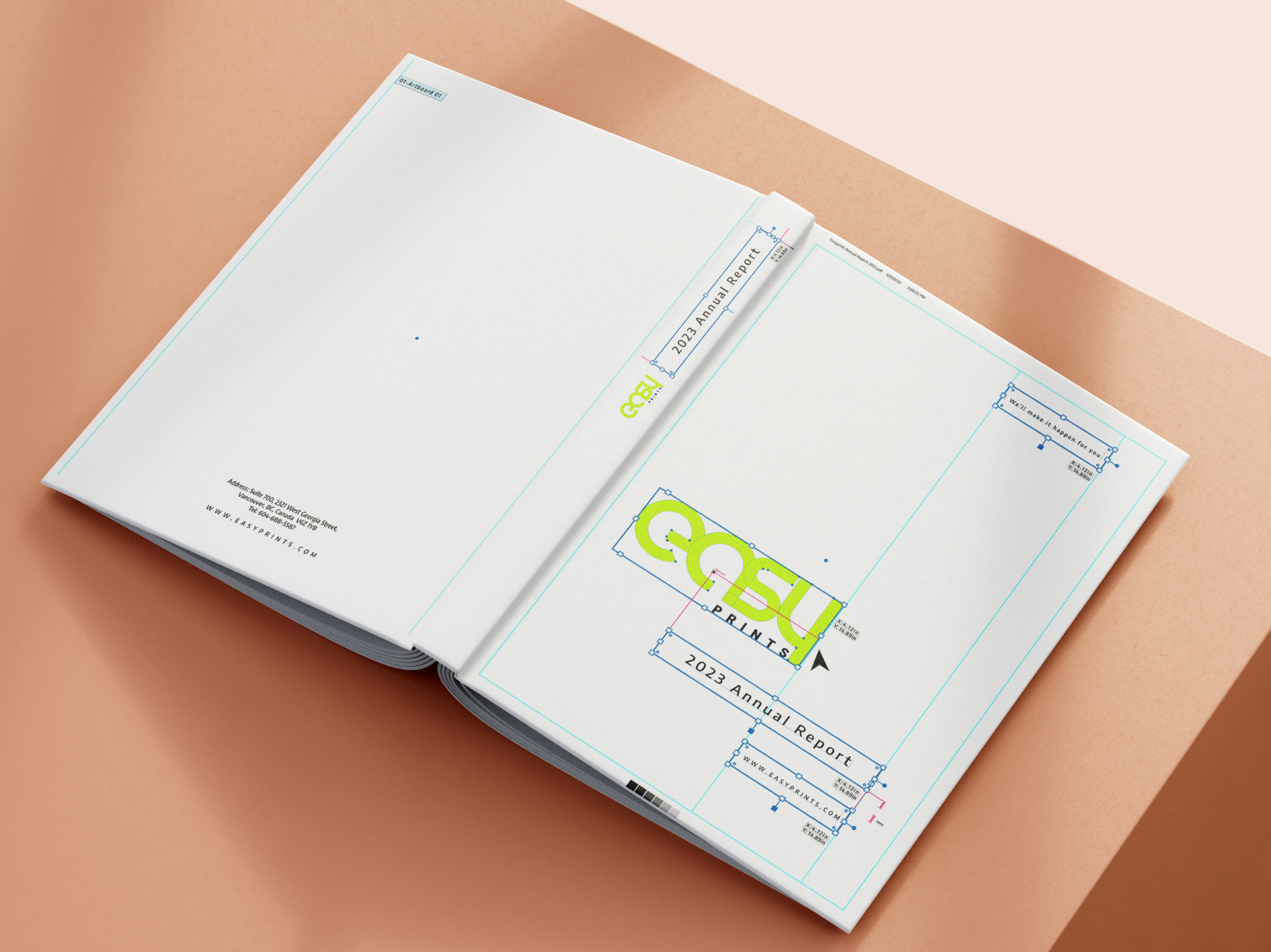
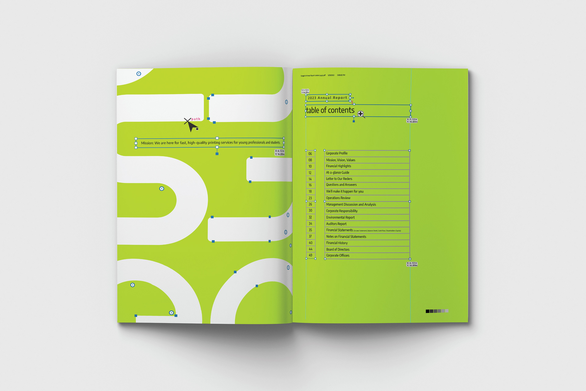
The use of design borders and direct selection in Adobe Illustrator allows for the creation of a visually appealing and structured layout. These elements help to enhance the overall design aesthetic and make the annual report book visually engaging for the readers.
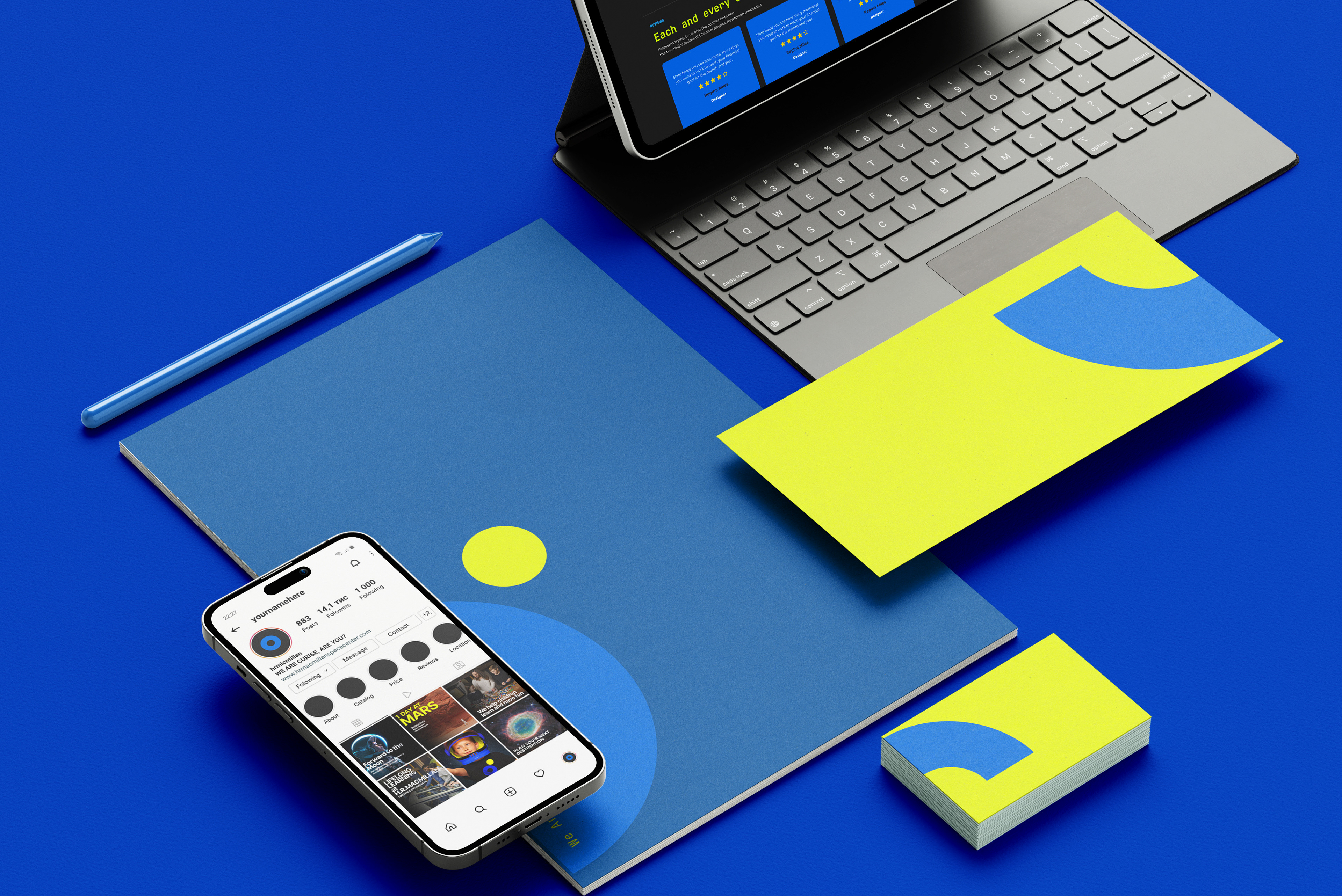
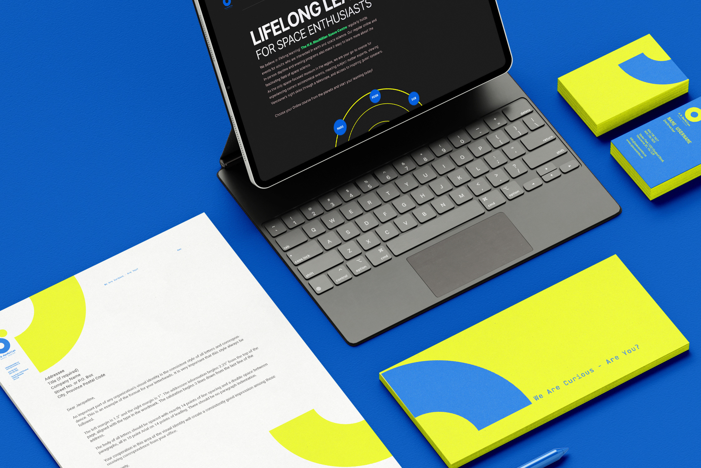
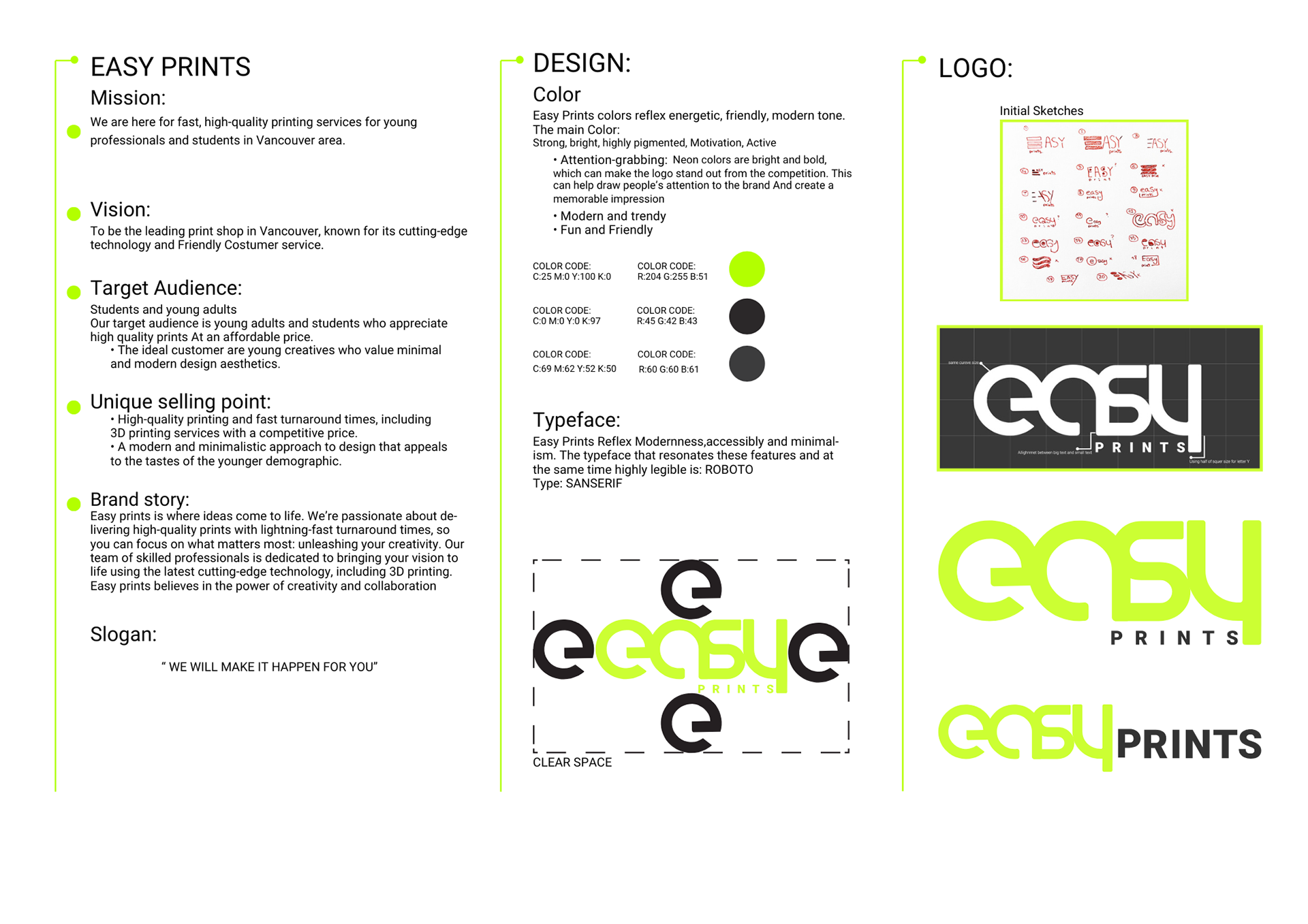
Color Scheme:
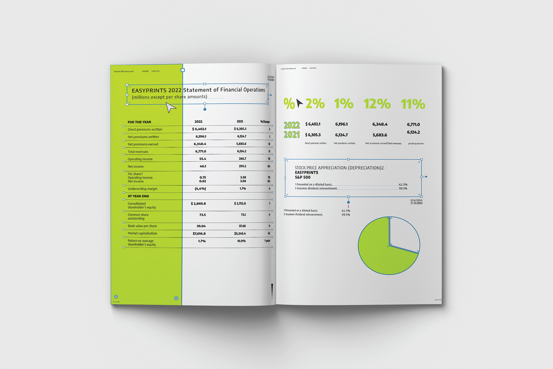
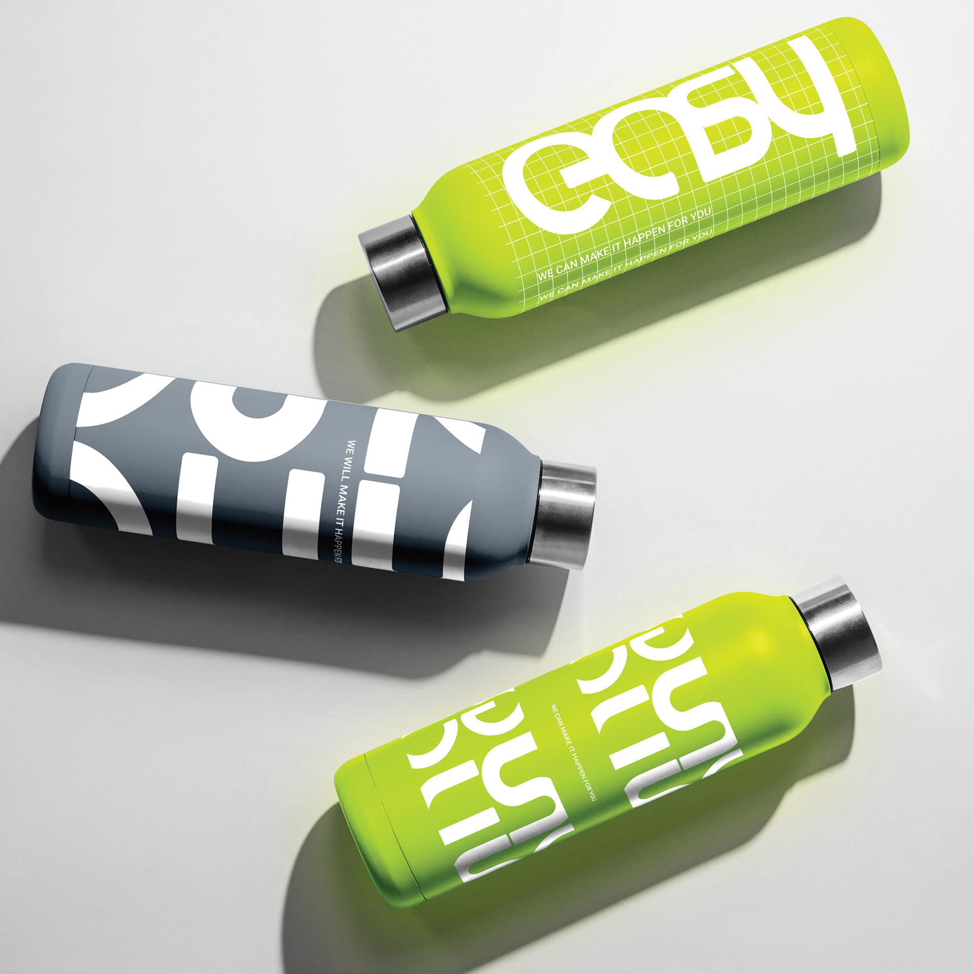
The color scheme used in the annual report is inspired by the print shop’s brand colors. By incorporating these colors throughout the design, a cohesive and consistent visual identity is established. This also helps to reinforce the connection between the design and the print business.
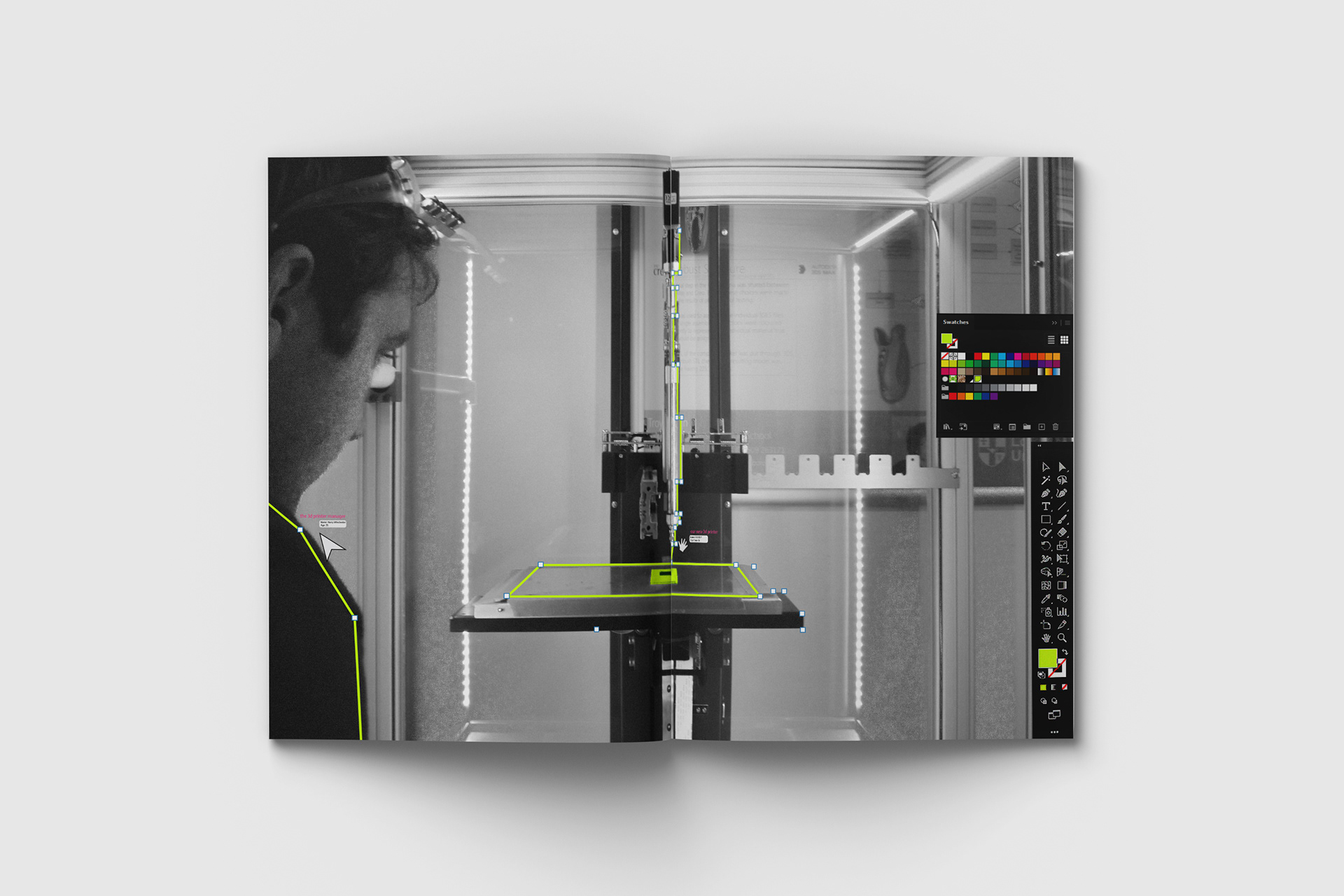
Black and White Pictures with a Touch of Brand's Green:
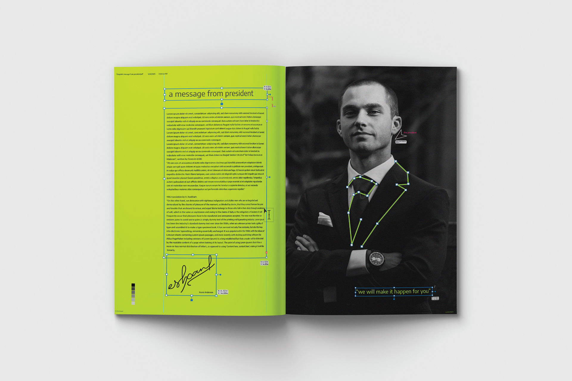
By using black and white pictures with a pop of green, a visually striking contrast is achieved. This choice adds a touch of vibrancy and freshness to the design, while still maintaining a professional and elegant look. The green color also complements the overall design and aligns with the print shop’s brand.
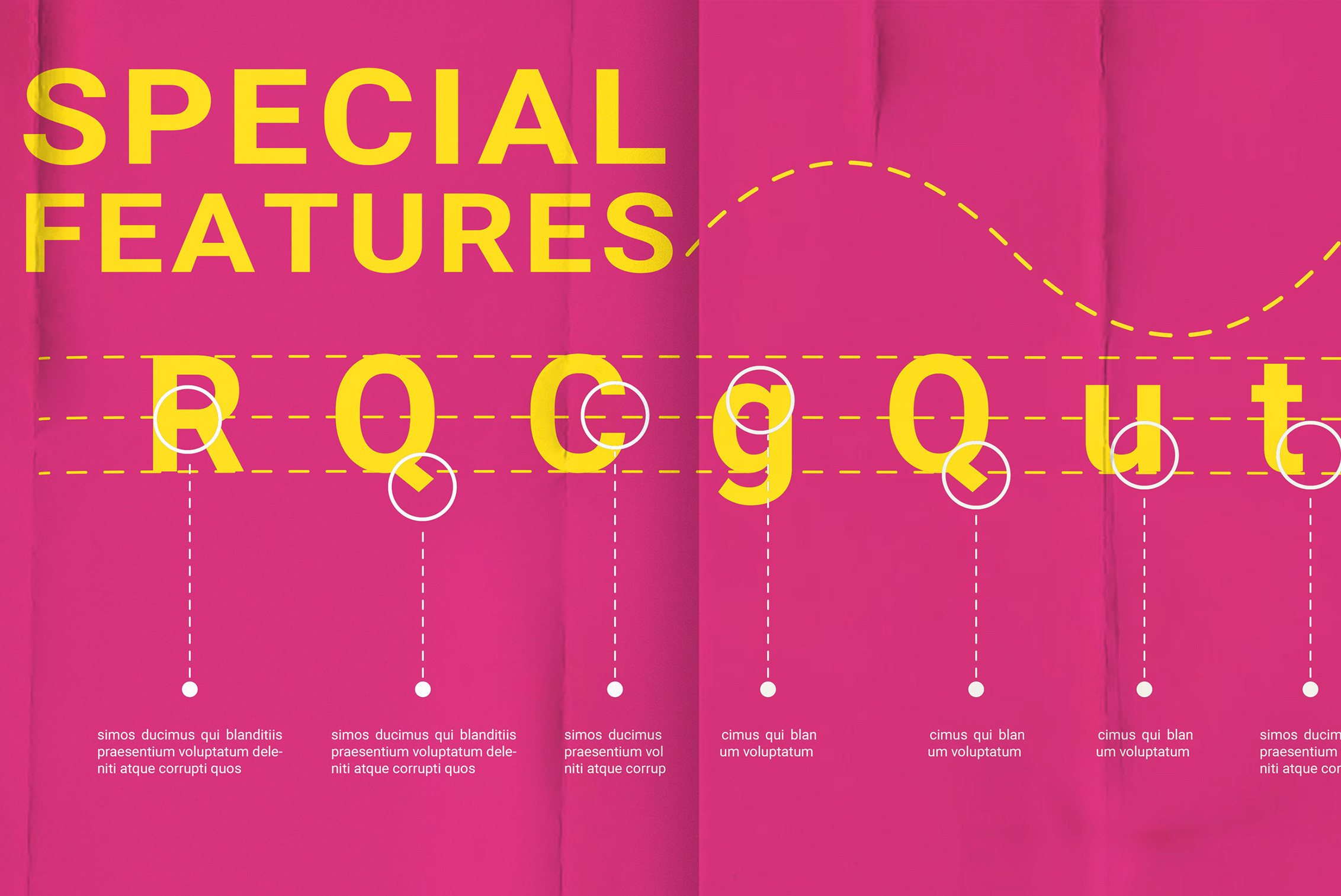
Design Elements:
The use of design borders and direct selection in Adobe Illustrator allows for the creation of a visually appealing and structured layout. These elements help to enhance the overall design aesthetic and make the annual report book visually engaging for the readers.
Color Scheme:
The color scheme used in the annual report is inspired by the print shop’s brand colors. By incorporating these colors throughout the design, a cohesive and consistent visual identity is established. This also helps to reinforce the connection between the design and the print business.
Black and White Pictures with a Touch of Brand's Green:
By using black and white pictures with a pop of green, a visually striking contrast is achieved. This choice adds a touch of vibrancy and freshness to the design, while still maintaining a professional and elegant look. The green color also complements the overall design and aligns with the print shop’s brand.