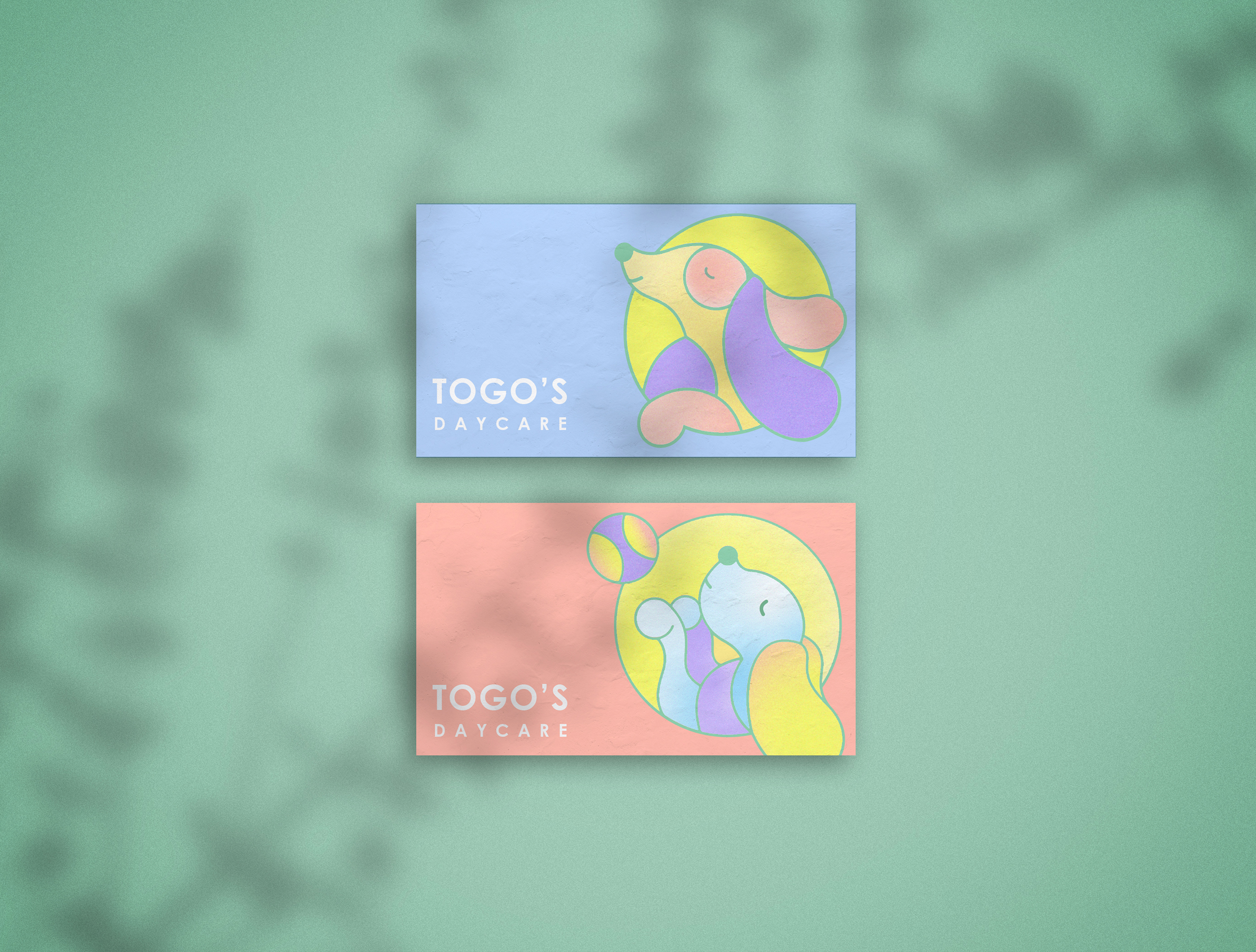
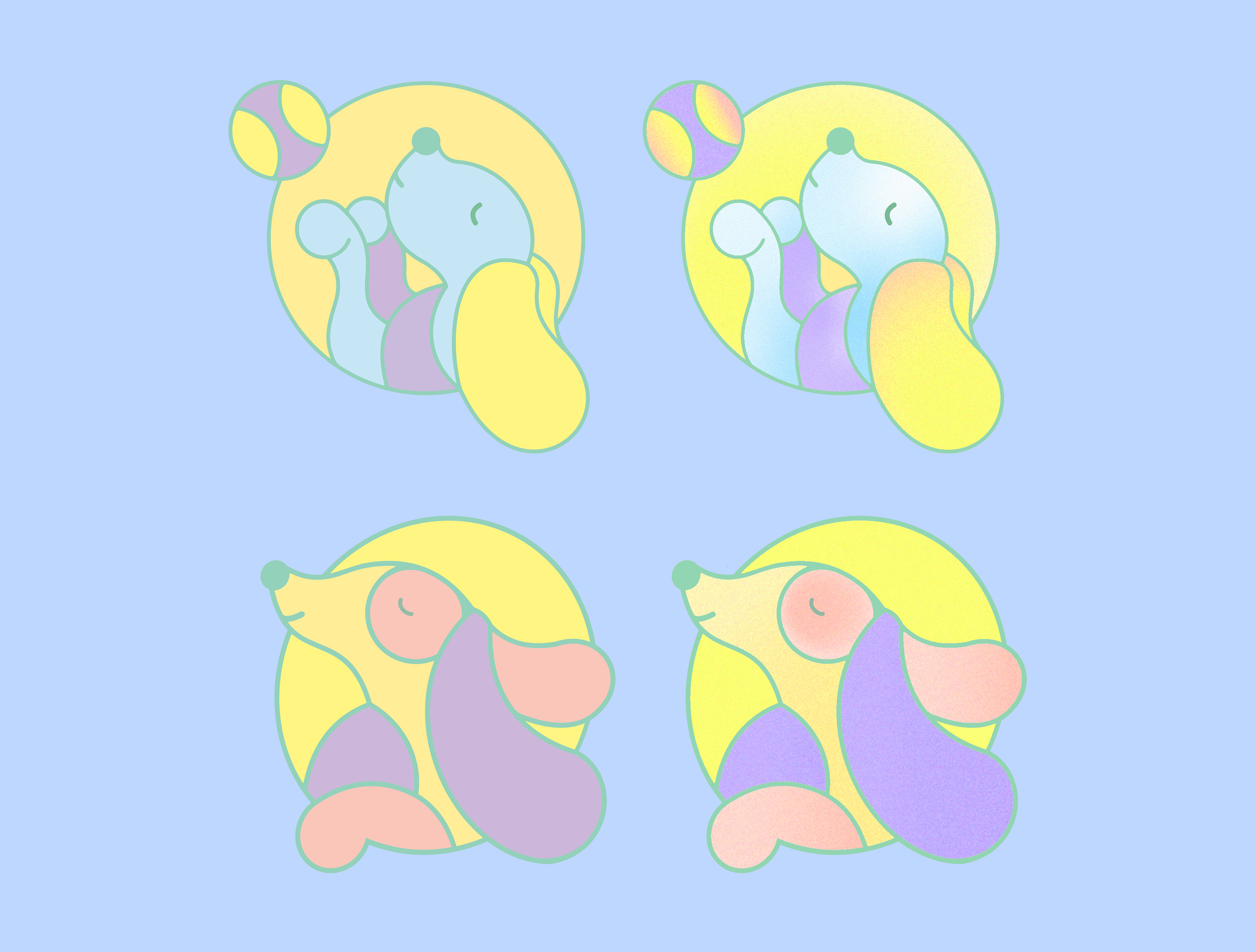
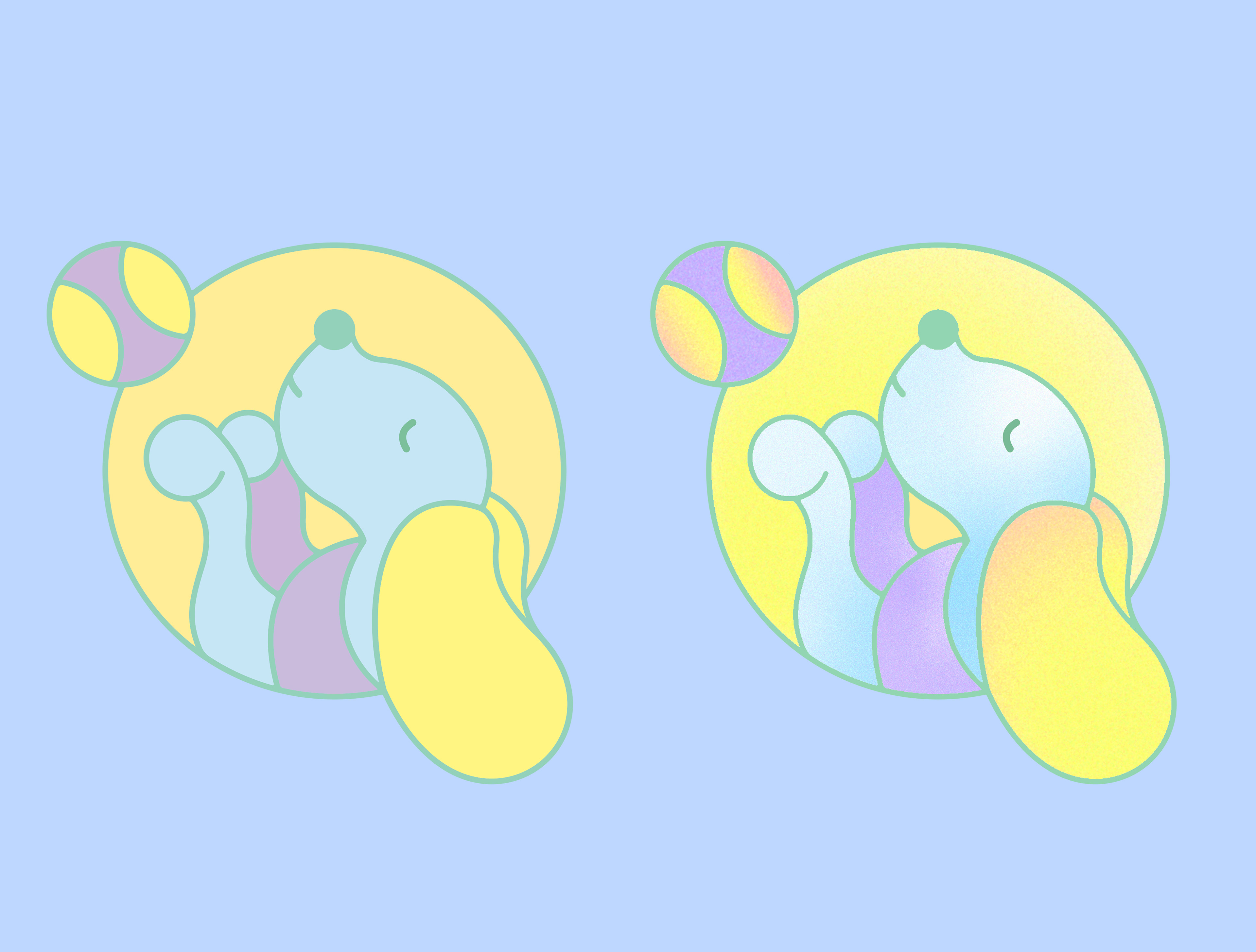
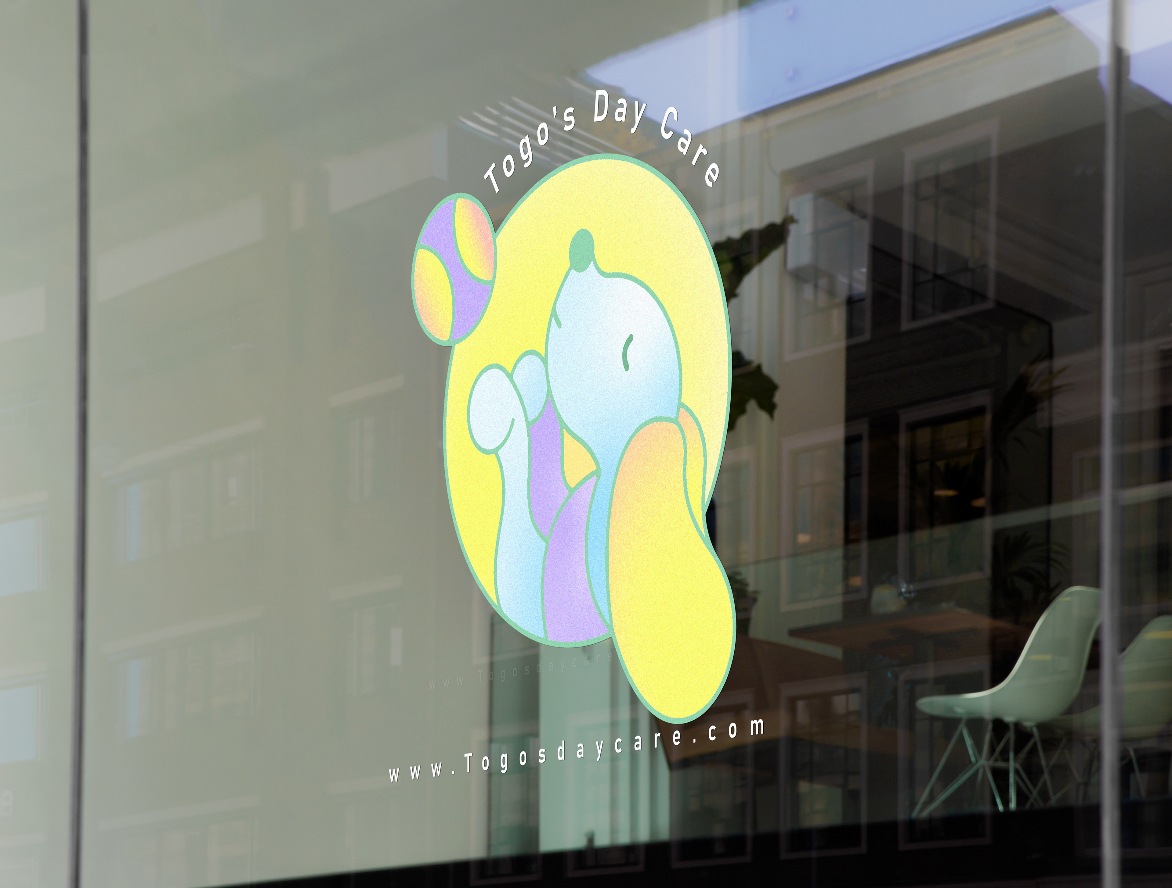
When it comes to logo design, I always focus on the meaning behind each element, whether it's the shapes, concept, or colors. For this dog daycare logo project, the goal was to create something engaging, cute, and straightforward.
I began the design process with sketches to establish the general look, then moved to Illustrator to refine the shapes, using only circles. I wanted the logo to have consistency in its structure, so I built it entirely from circles of different sizes— from the ball to the dog's ears, eyes, and nose. This approach gave the design a playful yet cohesive feel.
For the colors, I chose a pastel gradient to evoke a calming, baby-like vibe, symbolizing care and comfort. The soft tones help convey a sense of nurturing, making it clear that this daycare is a safe and loving place for furry friends.