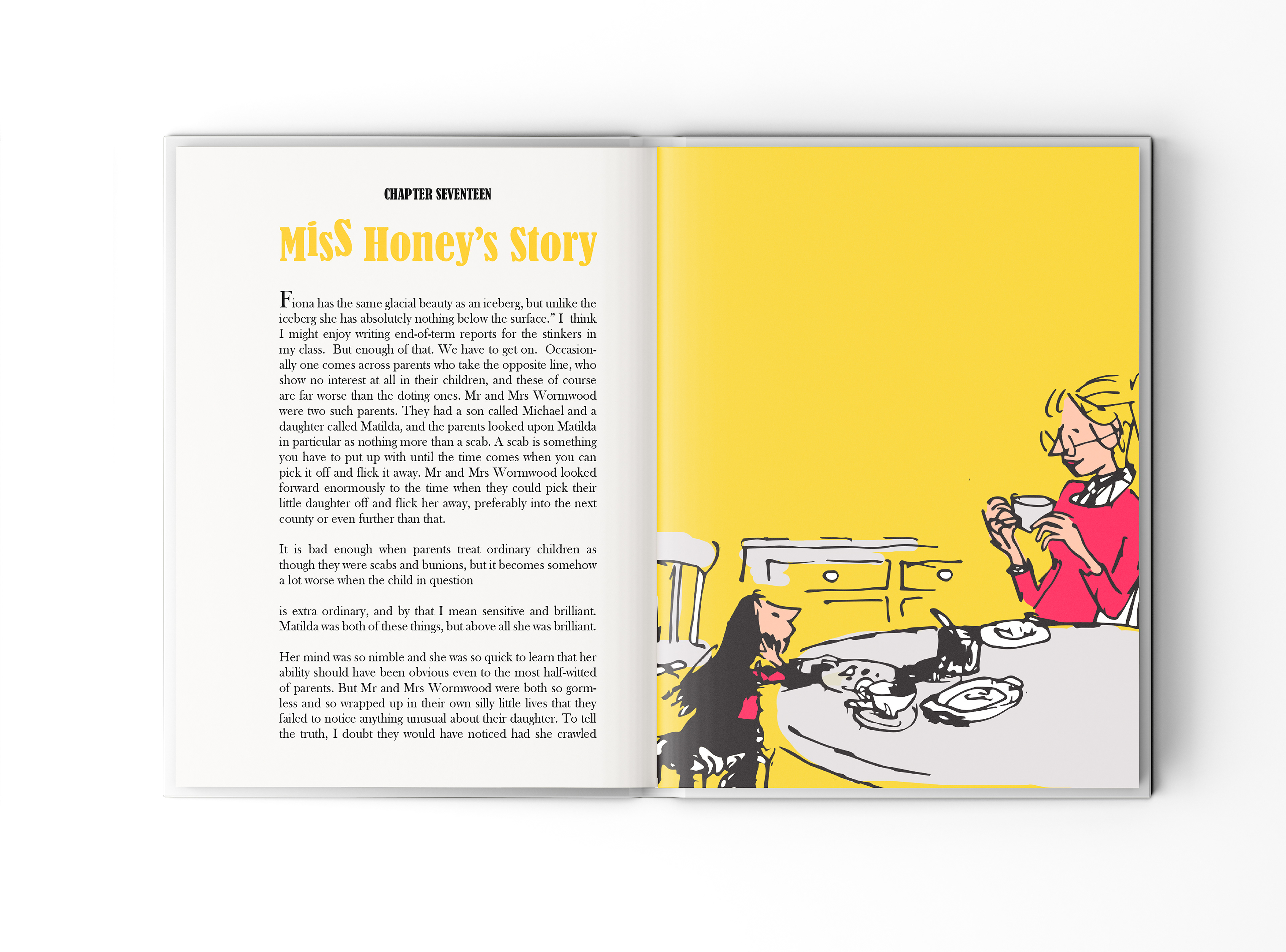
For this project, I wanted to take a different approach while staying true to Quentin Blake’s original illustrations. I experimented with composition, playing with the illustrations and integrating a limited color palette to create a fresh yet familiar design.
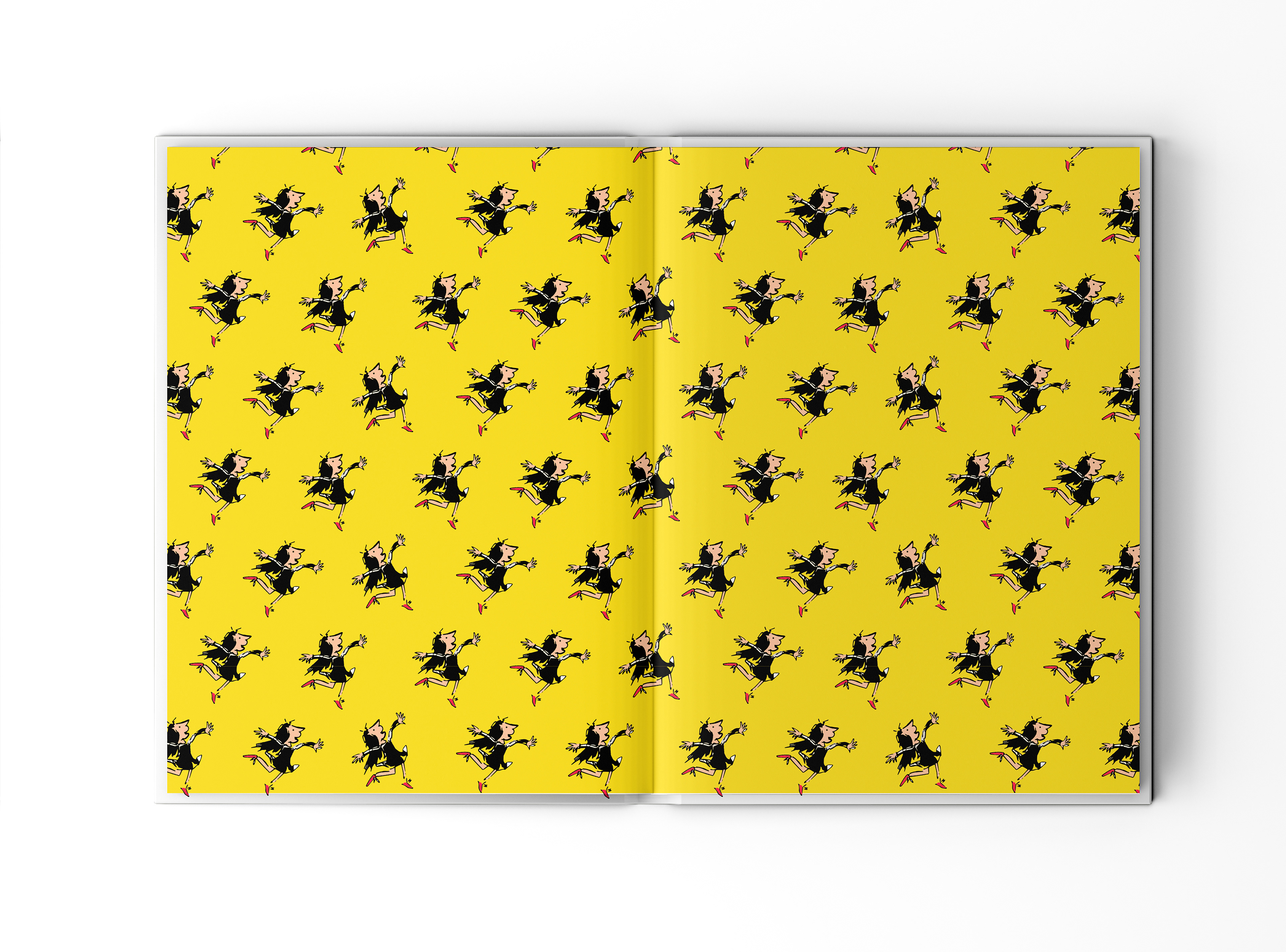
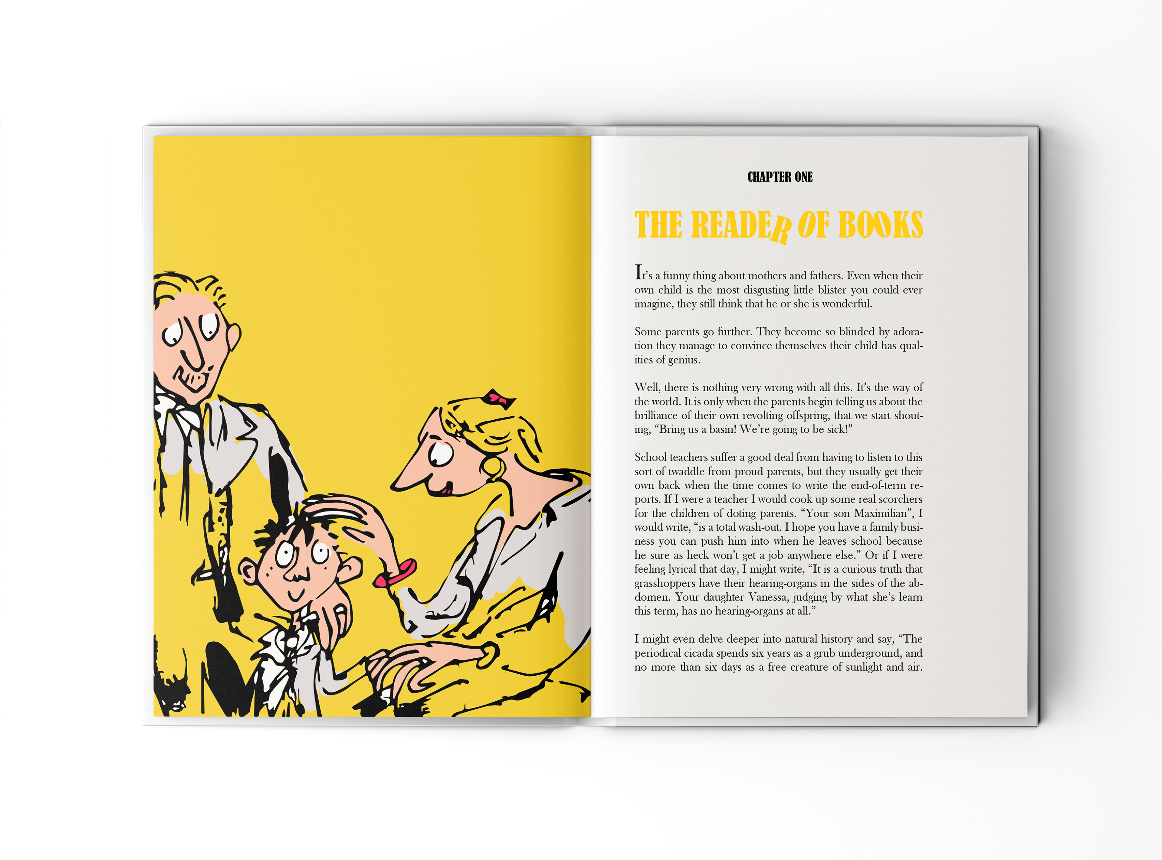
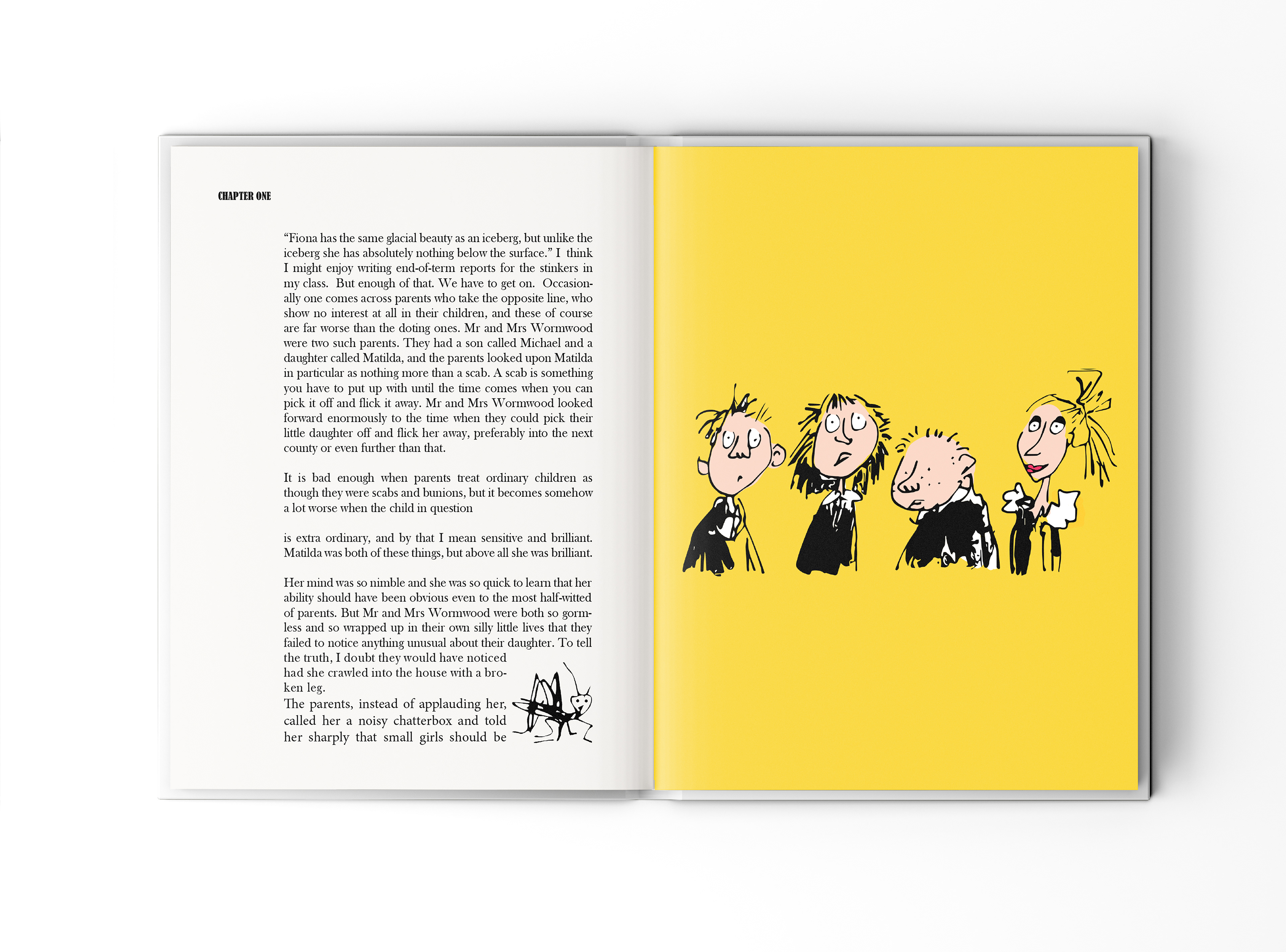
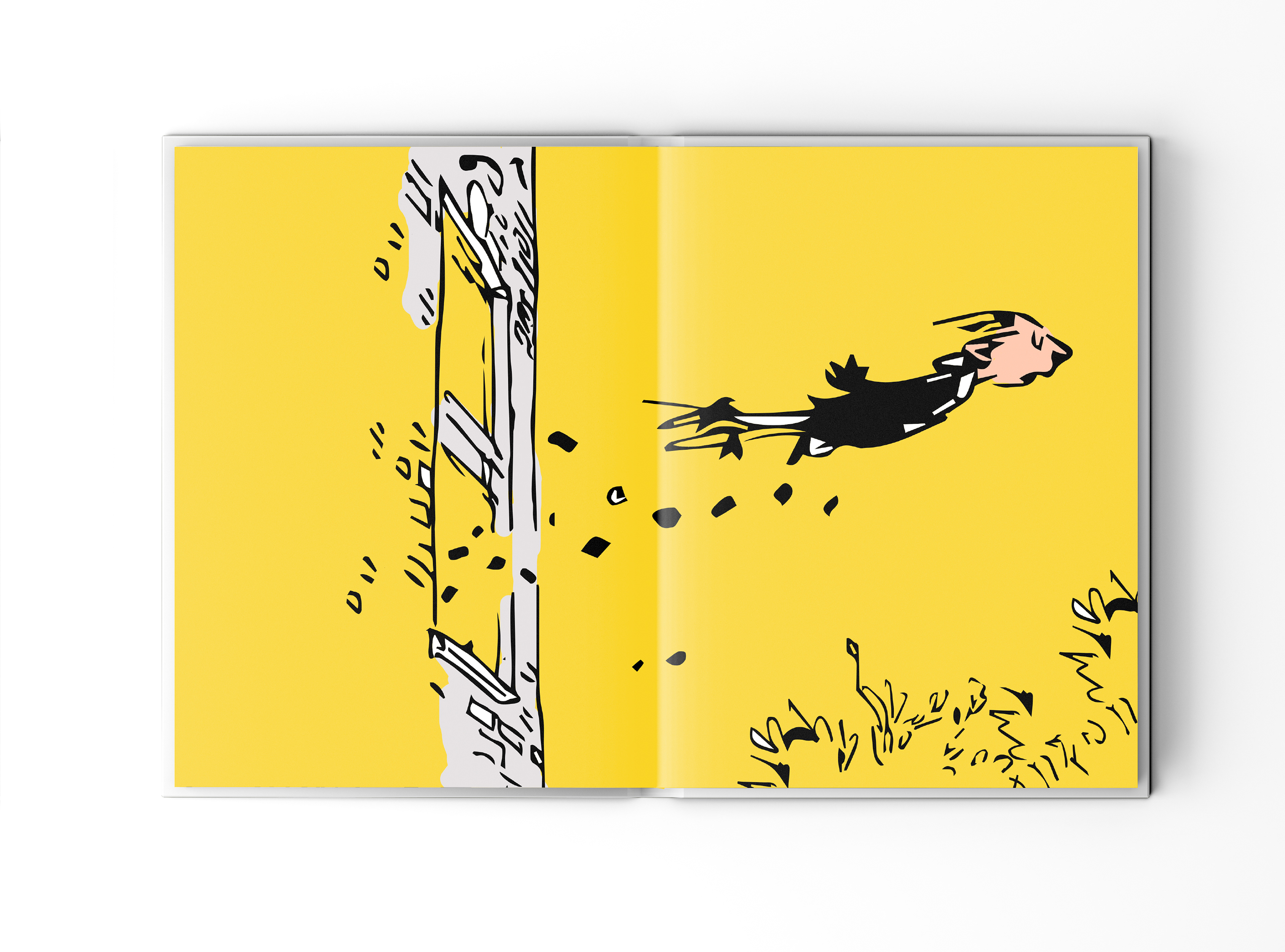
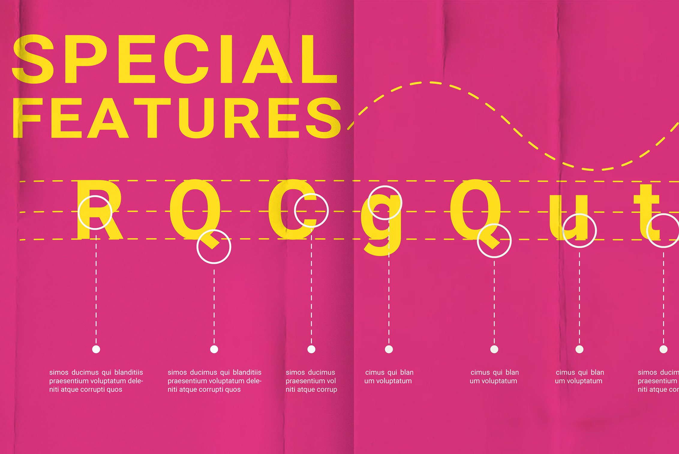
Inside the book, I used a mix of zoomed-in details and full-spread illustrations, depending on the mood of each scene. The typography was also designed to reflect the playful nature of Matilda, with some letters hanging or shifting to enhance the whimsical tone of the story.
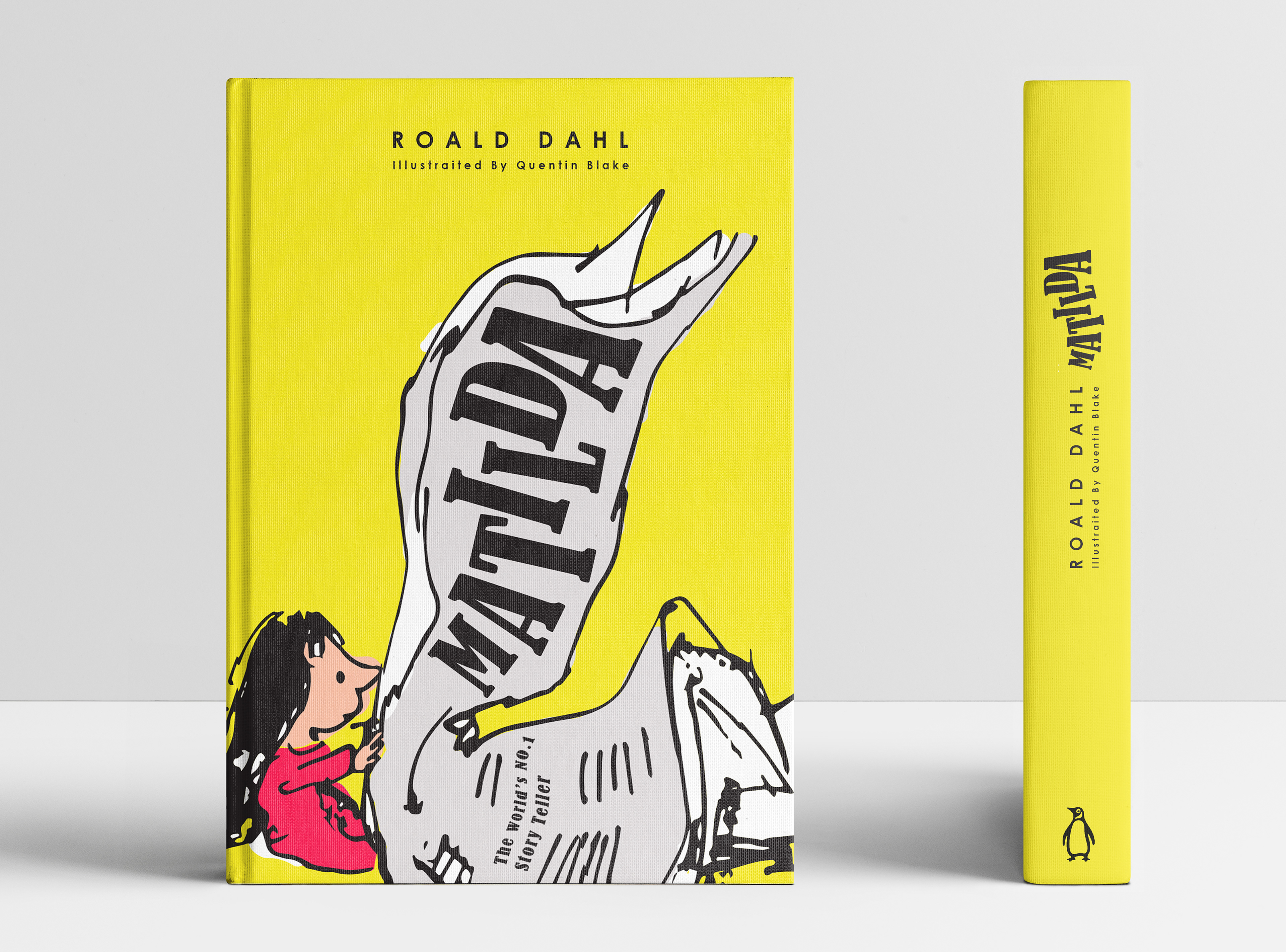
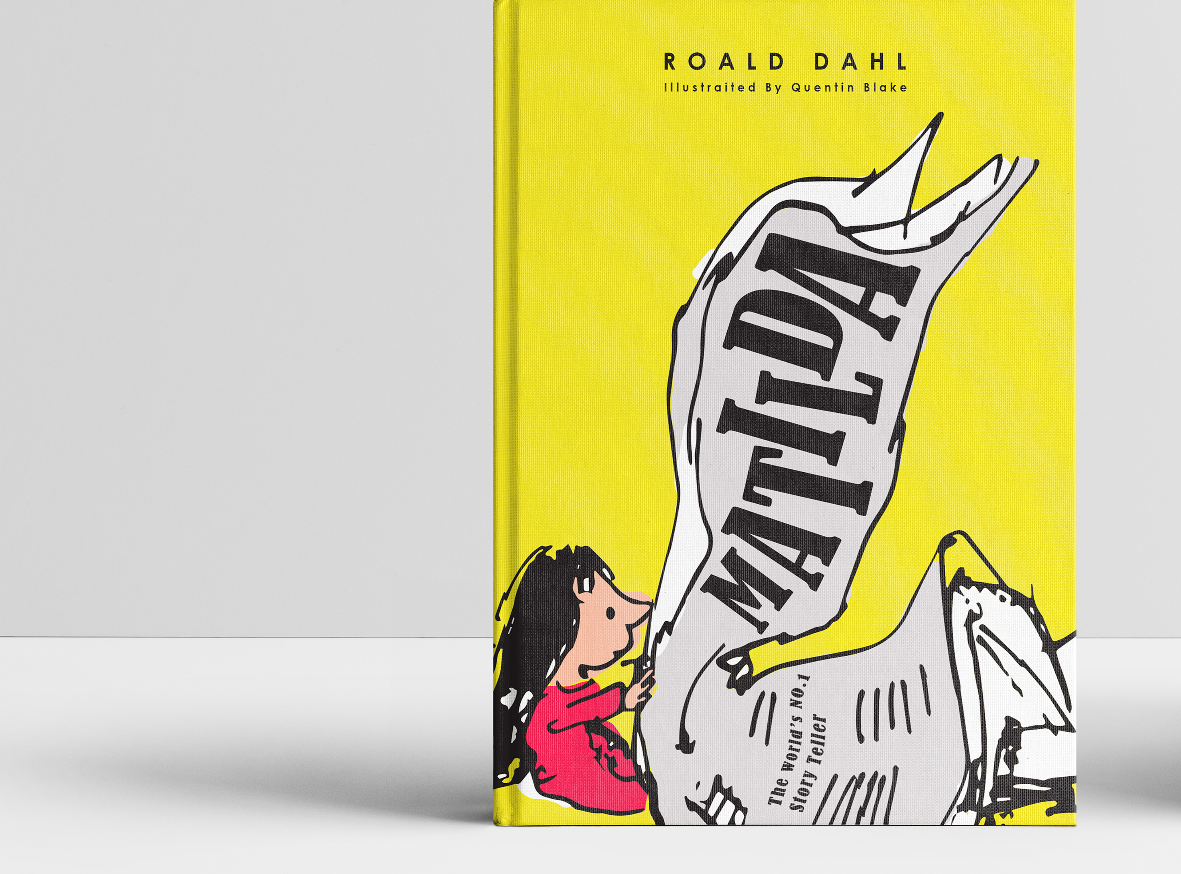
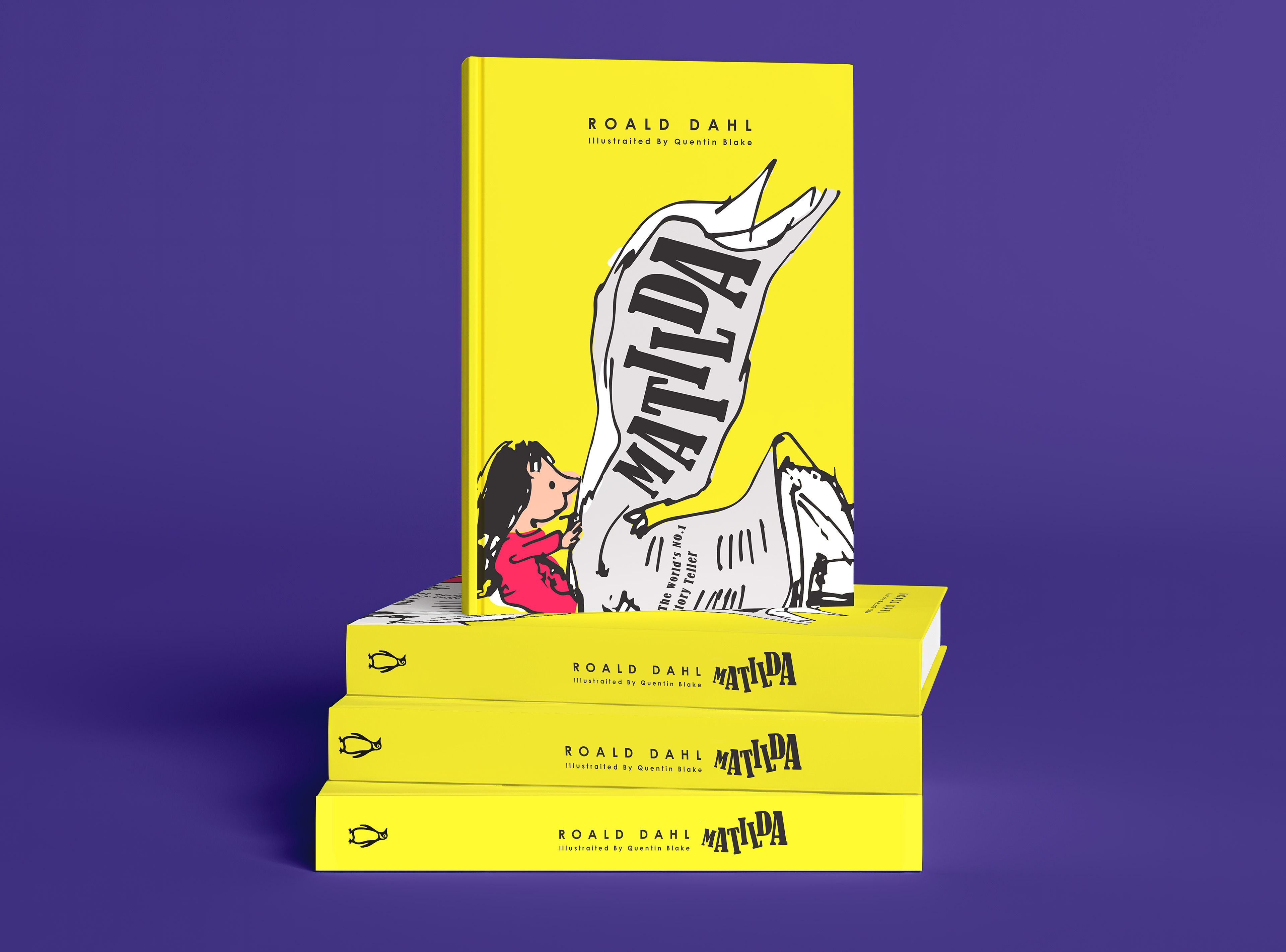
For the cover, I focused on Matilda’s love for books. I used an original illustration where she is reading a newspaper, but instead of standard text, I replaced it with the book title, Matilda, arranging the letters in a way that feels organic—almost as if they were always part of the illustration. This subtle yet intentional touch ties the design to the story’s themes while maintaining the charm of the original artwork.
COVER Design and Layout Design For Matilda Book